The Vibrant World of Colors in Design: A Journey of Visual Delight
Share this post so you don't forget!
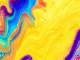
Colors, the magical language of the visual world, have the power to evoke emotions, tell stories, and captivate our senses. In the realm of design, the strategic use of colors plays a pivotal role in creating captivating and memorable experiences. From web design to product packaging, architecture to advertising, the judicious application of color can make or break the success of a design. Join us on a journey exploring the fascinating world of colors in design and how they wield their influence on our perceptions and behaviors.
Color Psychology: Unraveling the Emotions
Color psychology is a field of study that delves into how different hues can trigger specific emotional responses. While individual perceptions may vary, certain colors tend to evoke common emotions universally:
- Passionate Reds: The color of love, power, and energy. Red stimulates our senses and can create a sense of urgency or excitement. Brands often use red to convey passion and boldness.
- Calming Blues: Associated with tranquility and stability, blue has a soothing effect on the mind. It is frequently used in industries related to health and wellness.
- Cheerful Yellows: Symbolizing happiness and optimism, yellow brings warmth and joy to designs. However, excessive yellow may create feelings of anxiety.
- Nature-inspired Greens: Greens represent nature, growth, and harmony. They are often used in environmental and eco-friendly designs.
- Elegant Purples: Combining the energy of red and the calm of blue, purple is associated with luxury, creativity, and wisdom.
- Energetic Oranges: Orange is a vibrant and energetic color that exudes enthusiasm and excitement. It is often used to create a sense of adventure and playfulness.
- Balanced Neutrals: Black, white, gray, and brown are versatile neutrals that complement other colors. They can signify sophistication, simplicity, or timelessness, depending on the context.
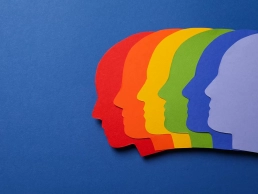
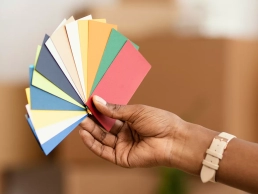
Creating Harmonious Color Schemes
While individual colors hold significant power, it is the thoughtful combination of colors that creates a harmonious and visually appealing design. Designers use various color schemes to achieve specific effects:
- Monochromatic: Utilizing different shades of a single color. Monochromatic schemes create an elegant and cohesive look, ideal for conveying a sense of simplicity and sophistication.
- Analogous: Involving colors that sit next to each other on the color wheel. Analogous schemes provide a smooth transition between hues and are commonly used for a calming and pleasing effect.
- Complementary: Combining colors that are opposite each other on the color wheel. Complementary schemes create high contrast and can be attention-grabbing and dynamic.
- Triadic: Involving three colors evenly spaced on the color wheel. Triadic schemes offer a balanced and visually stimulating composition.
- Split-Complementary: A variation of the complementary scheme that uses a color and the two adjacent to its complement. It provides a strong visual contrast while maintaining harmony.
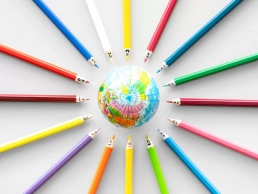
The Cultural Context of Color
Colors also hold cultural significance, and their interpretation can vary across different regions and societies. For example:
- Red: In Western cultures, red often symbolizes love or danger, while in Eastern cultures, it represents good luck and prosperity.
- White: In Western cultures, white is associated with purity and weddings, while in some Asian cultures, it signifies mourning and funerals.
Understanding cultural connotations is crucial when designing for a global audience to ensure that the intended message is received positively.
Enhancing User Experience with Colors
In the digital era, color plays a critical role in enhancing user experience (UX) on websites and applications. Here are some ways colors influence UX:

- Visual Hierarchy: Color helps establish a visual hierarchy by guiding users' attention to important elements on a page, such as call-to-action buttons or headlines.
- Brand Identity: Consistent use of colors aligned with a brand's identity fosters brand recognition and strengthens the emotional connection with the audience.
- Accessibility: Designers must consider color contrast to ensure that content remains legible for users with visual impairments.
- Mood and Tone: The color palette chosen for a website or app can set the mood and tone, affecting how users perceive the brand and content.
Conclusion
Colors are like the artist’s palette, offering endless possibilities to evoke emotions, communicate messages, and create stunning designs. Understanding color psychology, employing harmonious color schemes, considering cultural contexts, and leveraging colors for a better user experience are all essential elements in the world of design. Whether you’re crafting a website, a logo, or a physical product, let the magic of colors weave through your design, leaving a lasting impression on your audience. Embrace the power of colors, and watch as your designs come alive with a vibrant charm that leaves the world in awe.

FREE STUFF
Don’t miss! Free design asset downloads!
Check back daily for a new free design asset!
LICENSE
Be sure to read the license. The license says how you can use files downloaded from graphicfriend.com
TUTORIAL
Have questions about how to use mockups? A little tutorial on how to use mockups from graphicfriend.com
Thank you for your interest in my project with free mockups graphicfriend.com
I will be very grateful if you tell your friends and fellow designers about graphicfriend.com
All mockups on graphicfriend.com are made with love by me, you can download them for free and use them for commercial purposes.
Please see the license for full details.